
Page Layout & Reading Experience
To give readers a comfortable and efficient reading experience, EpoCanvas Docs uses a classic, clear three-column page layout. While reading a long article, you can always tell where you are in the site as a whole and which section of the current page you are reading.
UI Regions at a Glance
Open any documentation page and you will see four main functional regions:
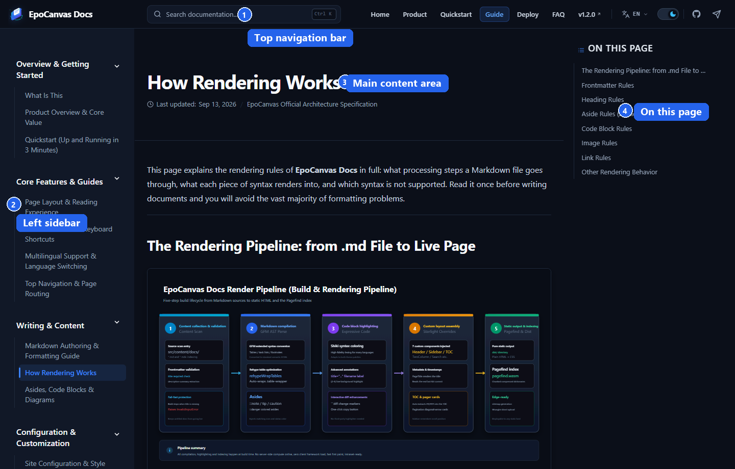
Figure: annotated three-column layout, using the “How Rendering Works” page as an example. (1) Top global navigation bar; (2) left category sidebar; (3) central body text reading area; (4) right-hand “On this page” outline. The four regions are marked in the image with borders and numbers.
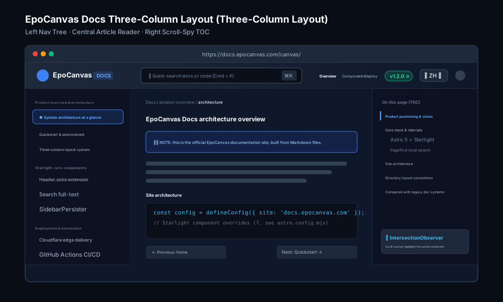
Figure: structural diagram of the three-column layout, naming each region and its role.
1. Top Global Navigation Bar (Header)
Sits at the very top of the page, fixed in place, and stays visible while you scroll. Its height is 3.5rem. From left to right, the header contains the following elements (see the annotated image below):

Figure: close-up of the header elements. (1) Logo and site name; (2) global search box; (3) main navigation buttons; (4) version badge; (5) language switcher; (6) light/dark theme toggle; (7) link to the GitHub repository; (8) link to the Telegram community.
- Site logo and title (1): the EpoCanvas icon and project name on the left; click to return to the documentation home page.
- Global search box (2): type keywords to search within the current page; press
Ctrl+K/Cmd+Kto open the site-wide search dialog. See Full-Text Search & Keyboard Shortcuts for details. - Main navigation buttons (3): quick links to frequently used sections such as “Home”, “Product”, and “Quickstart”; the section you are currently in is highlighted automatically.
- Version badge (4): shows the release version that the current documentation corresponds to (for example
v1.2.0); click to view the detailed changelog on GitHub. - Language switcher (5): click the language button to expand a list of 10 available languages. Choosing one takes you to the same article in that language, switching the navigation, sidebar, and body text together.
- Light/dark theme toggle (6): a sun/moon icon that switches between light mode and dark mode.
- GitHub and Telegram (7, 8): the icons on the right link to the open-source repository and the technical community.
2. Left Sidebar
Sits on the left side of the page (16.5rem wide, about 264 pixels) and shows all documentation chapters in a logical hierarchy:
- Collapsible groups: documents are organized into groups such as “Overview & Getting Started” and “Core Features & Guides”; click a group name to expand or collapse it.
- Current page highlight: the article you are reading is highlighted in the sidebar with a pill-shaped background in the theme color.
- Scroll position memory: when you jump from one article to another, the sidebar keeps its scroll position instead of jumping back to the top.
3. Main Content Area
Occupies the center of the screen and carries the actual documentation content:
- Page title and last-updated date: the top of the body shows the article title (taken from the
titlefield in the Frontmatter) and a “last updated” date, so you can judge how current the content is. - Comfortable reading width: the body area is capped at a maximum width of
60rem, preventing overly long lines on very wide monitors. - Previous/next links: every document automatically gets “Previous” and “Next” links at the end, so you can keep reading in sidebar order.
- Code block copy button: every code block has a copy button in its top-right corner for copying the code as-is.
4. Right-hand Table of Contents
Sits to the right of the body text:
- Automatic heading extraction: when rendering the page, the system parses the level-2 headings (
##) and level-3 headings (###) in the current document and builds the “On this page” outline. - Scroll-following highlight: as you scroll down while reading, the outline automatically highlights the section you are currently viewing.
- Smooth anchor navigation: clicking any entry in the outline smooth-scrolls the page to that paragraph and updates the anchor in the address bar (for example
#ui-regions-at-a-glance), which is handy for copying and sharing links.
Light and Dark Modes
EpoCanvas Docs ships both a light and a dark theme. Both color schemes are defined entirely by CSS variables in src/styles/custom.css:
- Follow the system preference: on first visit, the site detects the operating system’s light/dark setting and shows the matching theme.
- Manual toggle with memory: clicking the theme toggle in the header switches manually; the choice is stored in the browser’s LocalStorage and persists across visits.
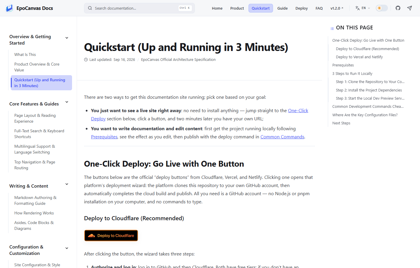
Figure: the same site in light mode (using the Quickstart page as an example).
Responsive Layout on Phones and Tablets
On screens of different sizes, such as phones and tablets, the layout adjusts automatically to fit:
| Device type | Screen width | Layout behavior |
|---|---|---|
| Wide desktop / laptop | >= 1152px | The full standard three-column layout (left sidebar + central body + right outline). |
| Tablet / narrow window | 800px ~ 1152px | The right-hand outline is hidden; the left navigation and body text remain as a two-column layout. |
| Smartphone | < 800px | Both sidebars collapse and the body text takes the full width. Tap the menu button in the header to slide out the sidebar drawer. |
Whether you are on an ultra-wide monitor or checking the docs on a phone, you get a natural, comfortable reading experience.